
You did the hard part. You collected the reviews. Customers left you star ratings, a few of them wrote real sentences, maybe some attached photos. Then those reviews went to live at the bottom of your product pages, below the description, below the shipping tab, in the one spot most shoppers never scroll to.
That is the most common review mistake I see on new Shopify stores. Not a lack of reviews. A lack of review placement. The social proof exists. It is just hidden from the people deciding whether to trust you.
This matters more than it sounds. Research from Northwestern University's Spiegel Research Center found that simply displaying reviews can lift conversion by around 270% compared to a product with none (Spiegel Research Center). Placement is how you cash that in. A review nobody sees does not move anybody.
So this post is about where to display reviews on your Shopify homepage, your collection pages, and above the fold on product pages, plus which widget belongs in each spot and how to avoid breaking your Google star ratings along the way. I will be specific about tools (mostly Judge.me, because its free tier already does all of this) and honest about the one move that cancels the gains: putting reviews everywhere. Let's place them where they earn their keep.
Why placement changes how many you sell
Most Shopify stores under $1M a year convert somewhere around 1.4%. The top 10% of stores convert above 4.7% (2026 benchmarks). That gap is not mostly about traffic quality. It is built from dozens of small decisions about trust, friction, and clarity, and where you show social proof is one of the larger ones.
Reviews do real work here. Products with 50 or more reviews convert about 4.6 times better than products with none (Red Stag). The Spiegel research found the lift is even larger on higher-priced items: about 380% for expensive products versus 190% for cheap ones. If you sell anything over $50, this is not a nice-to-have.
Here is the part most guides skip. The lift comes from reviews being seen at the moment a shopper is deciding, not from reviews simply existing in a database. A first-time visitor lands on your homepage knowing nothing about you. They click into a collection. They open a product. At each step they are asking one quiet question: can I trust this store. Visible reviews answer it. Buried reviews do not.

That is why placement beats volume past a certain point. You do not need 500 reviews to convert. You need the reviews you already have showing up where the decision happens. Leaving them buried at the bottom of a product page is the single most common version of this problem, and also the easiest to fix.
Where to display reviews on your Shopify homepage
Your homepage is the page first-time visitors and social traffic land on most. First-time visitors convert at roughly 1 to 2%, far below returning customers. They have the least reason to trust you, which makes the homepage the highest-value place to prove other people already do.
There are three homepage spots worth using, in order of impact.
A star rating line near the top
The fastest win is a single line of social proof high on the page: an average star rating and a total review count, something like "4.7 stars from 320 reviews." It is small, it loads fast, and it sits in the first thing people see. A UK retailer that moved its trust signals above the fold reported a 34% sitewide conversion increase (case example). You do not need a wall of testimonials up top. One honest number does the job.
A reviews carousel lower down
Below your hero and featured products, a rotating carousel of real reviews adds depth for the shoppers who keep scrolling. In Judge.me this is the Reviews Carousel, and it is free. One thing to know: by default it pulls your 15 most recent 5-star reviews and shows the same set on every page. That is fine, but a screen of nothing but perfect scores can read as staged, which is a real effect I will come back to at the end. Curate the set so it feels human.
Photo reviews, if you have them
If customers have sent photos, feature them. Visual reviews tend to convert better than text alone because they show the product in a real hand, in a real room. A short strip of customer photos on the homepage is more persuasive than another studio shot.
How to show reviews on Shopify collection pages
Collection pages are where shoppers compare your products side by side, and they are the most underoptimized page on most Shopify stores. Most owners pour attention into product pages and the homepage and leave collection pages as plain grids of images and prices.
Add a star rating badge under each product card. This is the small row of stars plus a review count that sits beneath the product title in the grid. It does two things at once: it gives every product instant social proof, and it lets a shopper sort the trustworthy options from the unproven ones without clicking into anything.
In Judge.me this is the Star Rating Badge, and you turn it on for collections from Settings, then Widgets, then Star Rating Badge, where there is a specific "add on collection pages" install option. On most Online Store 2.0 themes it installs automatically. If your theme is unusual, there is a short Liquid snippet you can paste instead, or support will add it for you.
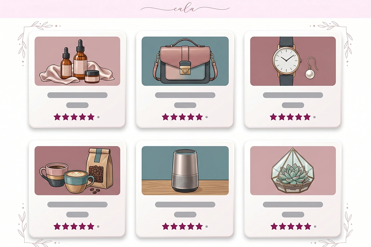
One honest caveat. A product with zero reviews showing "no reviews yet" next to siblings that have ratings can look worse than showing nothing. If a chunk of your catalog is brand new, either hide the badge on zero-review products or focus your review requests on filling those gaps first. Show the badge once a product has at least a few reviews behind it.
Reviews above the fold on product pages (and a note on the cart)
Now the product page, the page you probably already have reviews on, just in the wrong place. Shoppers spend about 10 to 15 seconds deciding whether a product page is worth their attention before they bounce (Baymard Institute). If your only social proof is 2,000 pixels down, it does not exist for that decision.
The fix is not to move your whole review section up. It is to split it. Put a compact rating summary, the star average and review count, right near the product title, above the fold. Keep the full review list with photos, filtering, and sorting lower on the page where shoppers who want detail will look for it. The summary earns the trust; the full list satisfies the researchers.
Most review apps handle this for you. The rating summary near the title is usually a small preview badge that links down to the full widget, and it is a separate, lightweight element from the review list itself.
What about the cart?
The cart is a quieter moment, but it is still a decision point, the last one before checkout. You do not need a review carousel here. A small trust line works better: a single star rating, a short "loved by 300+ customers" note, or a one-line testimonial near the checkout button. Keep it minimal. The cart's job is to reduce second thoughts, not to start a new research session.
Rating snippet or full review carousel: which goes where?
The two building blocks you will use most are the rating snippet and the full review display. They are not interchangeable, and matching the right one to the right spot is most of the skill here.
A rating snippet is the compact version: stars and a number, nothing else. It is small, fast, and works anywhere you need a quick trust signal without taking over the layout, like collection cards, the top of a product page, or a homepage header line.
A full review display shows the actual content: the text, the photos, the reviewer name and date. It belongs where someone has the attention to read, like the lower half of a product page, a dedicated reviews section, or a homepage carousel. It is heavier and needs more room.
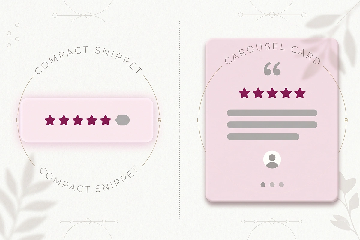
Here is how the common widgets map to placements.
| Widget type | What it shows | Best placement | When to use it |
|---|---|---|---|
| Rating snippet / preview badge | Star average and review count | Collection cards, top of product page, homepage header | You need fast trust in a tight space |
| Reviews carousel | Rotating set of full reviews | Homepage, landing pages | You want depth for scrollers, not product-specific |
| Product review widget | All reviews for one product, with filtering | Lower half of the product page | The shopper is deciding on a specific item |
| Dedicated reviews page | Every review across the store | Linked from the footer or nav | You have enough reviews to fill a page and want an SEO asset |
| Photo / UGC strip | Customer photos | Homepage, product page | You have visual reviews and a visual product |
A note on choosing an app: most stores under $1M a year do not need to pay for any of this. Judge.me's free tier covers the snippet, the carousel, the product widget, and the collection badge. Paid apps mostly add visual polish, Q&A, and reporting. If you are weighing options, here is an honest comparison of the main reviews apps for stores under $1M.
How review placement interacts with your Google star ratings
This is the part that quietly worries people, and the answer is reassuring. The star ratings that show up under your listing in Google search do not come from where your review widget sits visually. They come from review schema, structured data in the page's code that tells Google the average rating and review count for that product (how review schema earns star ratings in Google search).
So moving a widget higher or lower on the page does not change your search stars. What can break them is more mundane: removing the widget that injects the schema, running two review apps that fight over the same markup, or showing an aggregate rating in your visible content that does not match the one in your schema. Google flags that mismatch.
Two practical rules keep you safe. First, run one review app, not two. Stacking apps is the most common way stores end up with duplicate or conflicting structured data. Second, when you retire or merge a product, make sure its reviews and their schema move to the replacement listing. Reviews orphaned on a dead URL take their star snippet down with them, and most stores never notice the trust they lost.
That last one is worth saying plainly, because it is the review problem almost nobody plans for. A two-year-old store can lose hundreds of reviews when it sunsets old SKUs. Migrating those reviews to the active listing keeps both the social proof on the page and the stars in search.
Wrapping up: a placement order that works
If you only do a few things, do these, in this order. Put a star rating line above the fold on every product page, with the full reviews lower down. Add star badges to your collection cards. Then add one honest social-proof line and a curated carousel to your homepage. That covers the spots where the buying decision actually happens.
Then resist the urge to add more. Research on trust signals found that pages with one to three types of trust signal converted about 23% better than pages with none, but pages with seven or more types converted about 8% worse than the focused ones (trust signal research). Reviews on every block of every page stop reading as proof and start reading as clutter. Place them where decisions are made, not everywhere.
One more thing worth knowing, since it affects what you feature. Purchase likelihood tends to peak when a product's rating sits between 4.0 and 4.7 stars, not at a perfect 5.0. A flawless score makes shoppers suspicious. So a carousel that mixes a few honest four-star reviews in with the fives will usually outperform a wall of perfect scores. Real beats polished.
None of this requires a new app or a budget. It requires moving what you already have to where it counts, and leaving it alone after that. That is most of conversion work for a small store: fewer, better-placed decisions, made once and left to compound.
Want your reviews working everywhere they should?
Studio Niza's Reviews Management service installs your widgets across the homepage, collection pages, and product pages, replies to every review, and keeps your search stars attached even when products change. From $199/month.
See reviews management →Or email contact@studioniza.com if you have a specific question about your store. I read every one.
Frequently asked questions
If you're still unsure after reading these, just send the question.
Should I show reviews on my Shopify homepage if I only have a few? +
Yes, once you have around five. The Spiegel research found the first handful of reviews drives most of the conversion lift, so even a small honest count helps. Show an average star rating and the review count rather than a thin carousel until you have more.
Do I need a paid app to display reviews on my homepage and collection pages? +
No. Judge.me's free tier includes the homepage carousel, the rating snippet, the product review widget, and the collection star rating badge. Paid apps mainly add visual styling, Q&A, and reporting, which most stores under $1M a year do not need yet.
What is the difference between a rating snippet and a review carousel? +
A rating snippet is just the star average and review count, small enough to sit on a product card or a page header. A review carousel rotates through full reviews with text and photos and needs more space, so it suits a homepage or landing page.
Will showing reviews on collection pages slow my Shopify store down? +
Star rating badges are lightweight and rarely cause a noticeable slowdown. The bigger risk is running two review apps at once or loading heavy photo carousels everywhere. Stick to one app and keep image-heavy widgets to the pages that need them.
Does where I display reviews affect my Google star ratings? +
No. The stars in Google search come from review schema in your page code, not from where the widget appears on screen. Moving a widget up or down is safe; removing the widget that adds the schema, or running conflicting apps, is what takes the stars away.
How many reviews does a product need before placement matters? +
The biggest jump happens within the first five to ten reviews, after which the marginal benefit drops off. So placement matters as soon as a product has a handful. Focus your review requests on products sitting at zero before worrying about the ones that already have ten.
Should my homepage carousel only show five-star reviews? +
A curated mix reads as more trustworthy than a wall of perfect scores. Purchase likelihood tends to peak at ratings between 4.0 and 4.7 stars, because a flawless 5.0 can look staged. Let a few honest four-star reviews into the rotation.
Where do reviews convert best on a Shopify store? +
Wherever the buying decision happens: a star summary above the fold on product pages, star badges on collection cards, and an honest social-proof line on the homepage for first-time visitors. Reviews seen at the moment of decision do the work; reviews buried below the fold do not.